For your final project, you will demonstrate how perception is altered by viewing distance-- that is, how close or far away you are to what you are viewing. You will be required to carefully study an object selected from nature, and then to move closer into that object, abstracting its essential form. You must understand that abstraction always has its origins in an existing form. It is an expression of the fundamental structure found within a form. You arrive at abstraction by abstracting, removing, sampling, distilling, that essential design. Bearing down on its essence.
Here are some concepts you should keep in mind: Paint that is flung on a canvas or images that are completely detached from any sourced or referential form, are not abstractions, they belong within the domain of non-objective imagery. Representation is a very clear representation of the thing itself. Abstraction, is the pairing-down of the thing to its essential structure. Non-objectivity, is completely removed from any strictly-referenced structure.
Now that some of these terms and concepts have been sorted out, it is time to address the goals of your final project. You will be required to create three 10 x 10 inch paintings during the next two weeks.
1) These paintings will emerge from a natural object from which a drawn study will first be made: After selecting the object, you will examine it carefully, from every possible vantage point. Your drawing should be in HB graphite, without sketching, but with an even, sustained, clean line that follows the contour of the object's surface, does not utilize value/is without shading. It is a contour drawing that is a recording of surface changes, as if your eye is following the touch of your finger across the surface of your object. The line should be continuous and unbroken. Your object should fill an entire sheet of 10 x 10 bristol board, rather than a tiny object floating in the middle with a lot of surrounding white space.


2) After completing the study of your natural object, you will need to make a series of thumbnail sketches in which you will plan out a sequence of three images that abstracts the essential structure of your object. You can do this by either breaking the form down into configurations of shape, or by moving into the object, thereby altering your perception of it based on a shift in viewing distance/scale. After you have planned your sequence of three abstractions, you will draw them out in light graphite, on three sheets of 10 x 10 inch illustration board. Then, you will execute each using three color approaches:
In addition to understanding the basic expression of a given color contrast, consider the use of tinting, shading and toning. Use of black and white paint or space, should be kept to an absolute minimum. THIS PROJECT IS ABOUT YOUR UNDERSTANDING OF COLOR, NOT BLACK AND WHITE. If I see too much black or white or grey, you will be graded down.
- Local Color (the actual color of the object, unaffected by light or shadow)
- Cool-Warm Contrast
- Light-Dark Contrast
In addition to understanding the basic expression of a given color contrast, consider the use of tinting, shading and toning. Use of black and white paint or space, should be kept to an absolute minimum. THIS PROJECT IS ABOUT YOUR UNDERSTANDING OF COLOR, NOT BLACK AND WHITE. If I see too much black or white or grey, you will be graded down.
What you will be graded on is the following:
- Understanding of the mechanics of abstraction.
- Use of shape and space in composition..
- Grasp of basic color contrast expression.
- Technique: handling of paint, overall neatness in execution.
Below, to help guide you, are examples of a sequence of abstraction from 1917, by the Dutch artist Theo van Doesberg of the De Stijl movement. In them, van Doesberg abstracts the form of a cow, both in shape and finally in color. I am providing these images in helping you to understand the process of distillation that occurs in abstraction. These images are not here for you to adhere to any particular compositional formula or use of color. In fact, unlike Doesberg's cow, I do not want you to work from a living natural specimen nor do I want you to create as simplistic a composition with such a reliance on white and black, as Doesberg has done in his final panel.


Another valuable set of reference images, comes in the form of a series of drawn and etched studies from an elephant skull, by the British sculptor Henry Moore. Working from a skull gifted to him by a friend, Moore studied it from every angle and adjusted his viewing distance from the subject, allowing his gaze to penetrate the spaces within the skull, resulting in a series of abstractions. Please take note of how Moore isolated the forms found within the skull and framed them to create engaging compositions on their own. This is certainly another approach of abstraction that you take with your natural object. The image at the bottom, is of a sculpture created by Moore, titled Oval with Points (1968-1970), an abstract form derived from his studies of the elephant skull.


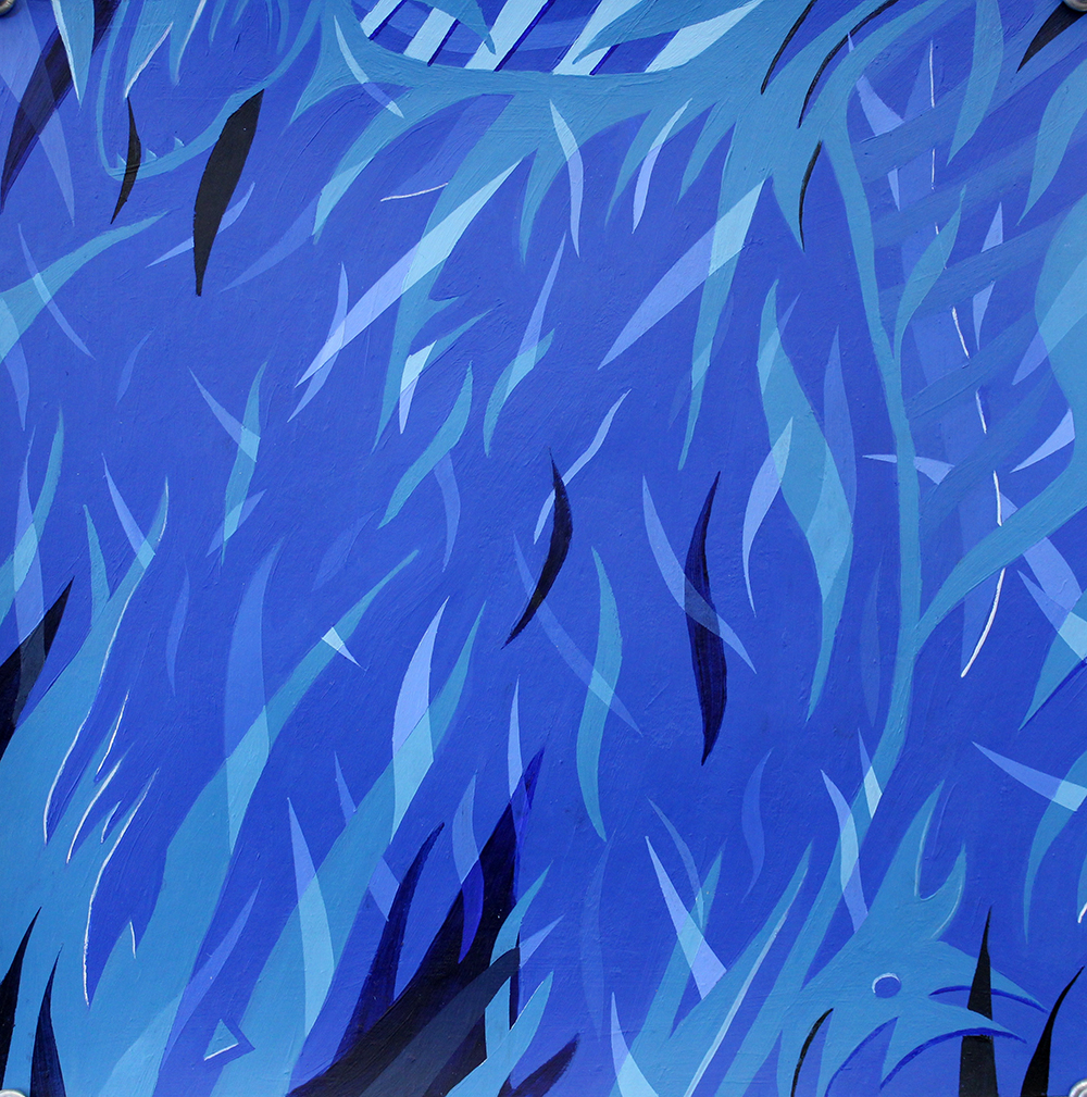
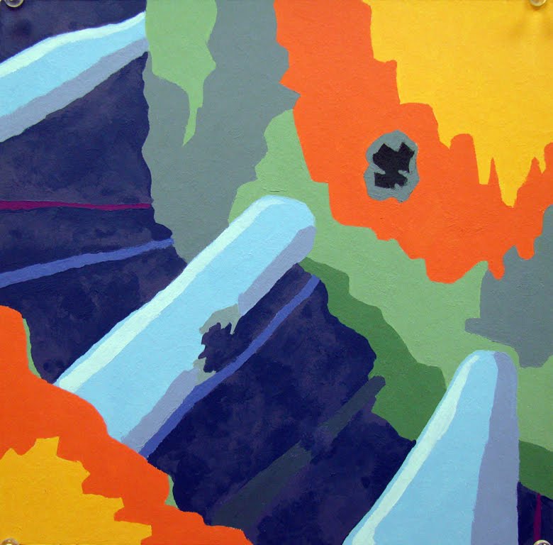
And here are some examples of longer abstraction sequences by students: