Tuesday, September 27, 2016

PAINTING CLASS: COLOR NOTES

"Color is life, for a world without color seems dead. As a flame produces light, light produces color. As intonation lends color to the spoken word, color lends spiritually realized sound to form." --Johannes Itten, The Art of Color (1960)

Color is a property of light. At its most basic, It is the perception of how light is absorbed or reflected by matter. The two parts of light are luminosity and wavelengthLuminosity is the degree of brightness of light. Color is determined by a range of light waves, measured in wavelengths which are affected by different surfaces and media through refraction, reflection, diffraction, or interference. Each of these wavelengths form the visible spectrum, a rainbow sequence of hues: RED, ORANGE, YELLOW, GREEN, BLUE, INDIGO and VIOLET. It should be noted that white is the addition of all hues, and black is the subtraction of all hues. The wavelengths of the visible spectrum can be produced by passing a white light through a prism. The prism refracts the white light and splits it into the rainbow sequence of hues.

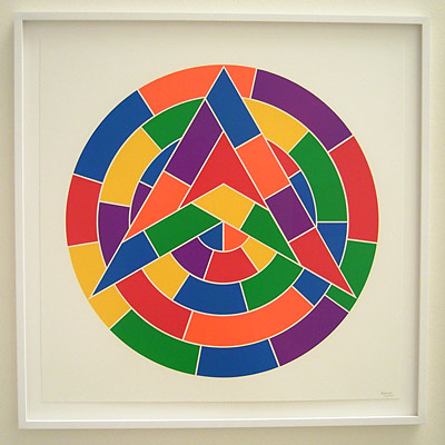
The 12-Hue Color Circle or The Itten Color Wheel

We begin with three primary colorsyellowred and blue. Then, in order to arrive at the secondary colors, the primary colors are mixed thus:


yellow + red = orange
yellow + blue = green
red + blue = violet

One crucial thing to remember when arriving at the secondary colors, is that they cannot lean to their primary color sources, meaning that the green must not be too yellow or too blue, or that the orange cannot be too red or too yellow. They must be mixed thoroughly to achieve their secondary status on the color wheel. Now, in order to arrive at the tertiary colors, a mixing of the primary colors with the secondary colors follows this formula:

yellow + orange = yellow-orange
red + orange = red-orange
red + violet = red-violet
blue + violet = blue-violet
blue + green = blue-green

yellow + green = yellow-green


The three primary colors + the three secondary colors + the six tertiary colors, forms the 12-hue color circle. What we have, in essence, is an artificially-divided and measured model of the visible spectrum.


The 12-hue color wheel, sometimes referred to as the Itten Color Wheel, was a color model that was developed by Johannes Itten (1888 - 1967), an influential Swiss teacher, designer and painter who taught at the Bauhaus design school in WeimarDessau and Berlin.

Although there were previous color models and systems developed by the likes of Johann Wolfgang von Goethe and Sir Issac Newton (who first used the term spectrum, Latin for "appearance" or "apparition"), the Itten system creates a more balanced, symmetrical model. Although there are some problems regarding the equality of its steps, for our purposes the Itten model will do just fine.

The achievement of Itten was not only in physically organizing the visible spectrum in a balanced fashion, but more importantly in understanding the psychology of color. Although he worked to systematize color, he held a strong belief in its intuitive application by identifying the emotional associations we have with certain colors. In fact, it was Itten who we can credit with developing a seasonal analysis of colors, identifying four different and distinct personality types and associating them with the seasons, and then attributing color to those. When we think of whether a color is cool or warm, Itten steered our perceptions to such an identification.

The Seven Color Contrasts

The expression of color gains maximum effect through the use of contrast, or perception through comparison. Itten identified as what is known as the seven color contrasts:

1. Contrast of Hue

2. Light-Dark Contrast
3. Cold-Warm Contrast

4. Complimentary Contrast
5. Simultaneous Contrast
6. Contrast of Saturation
7. Contrast of Extension


Each of these will require an in-depth explanation and understanding, which we will explore throughout the semester.

General Notes on Painting:

-Paint your composition, with great care, precision and patience, taking care to fill in the areas of
 color completely.

-The image area should be opaque, not transparent, with no streaking and none of the illustration board showing through.

-Do not slop on the paint heavily, but distribute evenly and smoothly. If your painting is heavy-handed and lumpy with streaks, I will ask you to repaint your piece.


-Mix your colors thoroughly, before applying the paint to the board. Do not use too much water, as this will thin the paint out too much and make it transparent. Do not mix with your brush, but with a palette knife. If you mix color with your brush, your color will be streaked with unmixed color.

-If you are painting a straight line, consider using your drafting tape or a guide to help you-- No shaky or crooked lines on hard-edged projects. If you are using drafting tape, do not brush into the tape, as this will force paint under it, and cause excessive bleeding. Rather, paint along the edge of the tape.Also make sure the tape is not to tacky, so that it will not tear the surface of your board.

-Control of your brush is the key here. And you must use the correct brush size/bristle-type, per
 what was listed on your materials guide you received at the start of the semester.

Images (from top to bottom): Farbkreis (1961), by Johannes Itten; Color Wheel from Theory of Colours (1810), by Johann Wolfgang von Goethe; 7 Color and 12 Color Circles (1708), by Claude Boutet; Color circle with correlating musical notes and planetary symbols from Opticks (1704), by Sir Issac Newton; cover to The Art of Color: The Subjective Experience and Objective Rationale of Color (1961); Color Star, by Johannes itten

PAINTING CLASS: SOL LEWITT STARS

The American artist Sol LeWitt has created a number of prints and wall drawings/paintings, which explore the form of the star with consideration given to color relationships within the star. There is a series of aquatint prints by Mr. LeWitt, created in 1993. The colors in them bear more than a passing resemblance to those used in early American Amish quilts. Here are two of the prints from the series:


Additionally, in 2002, Lewitt created a portfolio of six linocuts exploring the star once again-- this time with much more intense hues:


PAINTING CLASS: Project 2: Exploring Color Contrast


The images shown below, illustrate the specific Amish quilt form known as Sunshine and Shadow. These quilts demonstrate a composition with an intense core, or focused center. From this diamond-like center, are a series of interchanging colors that radiate in concentric geometric groupings. Surrounding this mass of colors, will be a wide, solid border, that contrasts with the core. The resulting effect is that the diamond, with its multiple colors, can seem to vibrate and come alive, within a more static frame. This frame will often be anchored and set into another, thinner border with patches of color at each corner. The entire composition results in a meditative harmony in which geometric form and color contrasts achieve a balanced relationship.


Consider these examples:


For your next project, you will explore color saturation and contrasts between light and dark. You will create a response to the Sunshine and Shadow Amish Quilt composition, in an expression of both color contrast and geometric shape.

Some terminology {

-Value (sometimes called tone) is the darkness or lightness of a color.
-Saturation (sometimes called intensity or chroma) is the amount of pure hue in a color, its vividness. Colors that are unsaturated are grayer than pure hues. The purpose of this exercise is to work on strategies to control degrees of value and saturation.

When dealing with light and dark contrast, consider both light and dark in terms of the relationship of hue as found in the primary, secondary and tertiary designations of your color wheel, but also in terms of mixing both white and black to your hues to achieve tinted and shaded colors. You are required in some measure to use tinting and shading as a means of developing contrast. When doing so, it would be good to refer back to your grey scale studies to consider the sort of range you may achieve. When adding white or black to a hue, it is always crucial to first take into account the light/dark identity of the hue you are adding to. How light or dark is it to begin with? In what direction do I wish to push this hue, and how much tinting or shading will achieve this? if you are not relying on tinting or shading to achieve a light-dark contrast, then you must still be aware of the light-dark nature of the hue you are choosing: that blue is darker than yellow, that red is darker than orange, etc. Your final composition should be arrived at with consideration given to how the Amish quilters successfully distributed color through the use of light and dark contrast. Before painting your composition, remember to plan your the location of your color well in advance-- do not make up the distribution of your color as you go along.

Student thumbnails for this project. Please note how the student is considering the distribution of light and dark using graphite:

When creating your composition, in addition to expressing a light-dark contrast of color, you must also distribute this color using only geometric shape. This means we are not making a representational image, but an abstraction that is composed of geometric shapes. Your composition should contain color from top to bottom, side to side-- please do not leave any blank, white or unpainted areas. Plan your piece out using thumbnail strategies, copy your image in light pencil onto an 10 x 10 inch piece of illustration board, with 1/2 inch, clean margins. Also, refresh your understanding of the steps of successfully using your paint. Since you will be working in small, geometric units, it should be easier to fill in the area with color, without too much in the way of paint buildup, quick drying, or excessive streaking. When using tape or a straight edge to mask off an area, or create a straight line, do not paint into or against the tape or straight edge, as this will force paint under it and build up a high edge on your paint. Rather, paint along the side of the tape or straight edge, in a direction that is parallel to it. The consistency of your paint should be regulated, not too watery or thick, but as smooth and consistent as possible. Remember, do not mix the paint with your brush, use your palette knife.

On Tuesday, October the 4th, you will need to turn in your piece along with your thumbnail compositions for the class critique.


ADDITIONALLY, please find one natural object to bring into class as a subject to work from. The object should be organic and grown. A flower, a complex vegetable or fruit. Something with a dynamic form containing much surface variation. An orange, a pear or an apple would be examples of what NOT to bring in, as their surfaces are smooth and plain. A pineapple, however, has many surface changes. A large seashell would also, or a large piece of tree bark. Your object should also not be too small, as you want to be able to examine the surface structure at great length for your drawing. If you are in doubt as to what you have chosen, feel free to email me for advice. Be prepared to create a drawing/painting of this, in the 10/4 class session.

Here, along with the two large images at the start of this entry, are examples of how previous students of mine realized this project:


Images (third from top to bottom): 1. Pennsylvania Amish Sunshine and Shadow Quilt, c. 1930, pieced wool; 2. Amish (Penn.?) Sunshine and Shadow Quilt, c. 1900, wool; 3. Pennsylvania Amish Sunshine and Shadow Quilt, c. 1900 - 1925, wool; 4. Amish Sunshine and Shadow Quilt, c. 1970, wool.

Tuesday, September 20, 2016

DRAWING CLASSES: LINE: Same Subject / Different Media / Different Line

When considering your use of line, also take into account a) how its character relates to your subject matter-- either how it best serves the expression of your subject's form, or expresses the temperament you wish to convey and b) how the line is born of the medium you are using-- different drawing media are capable of producing different lines.

As far as different line quality or character is concerned, consider the following types: mechanical, structural, lyrical, constricted or aggressive, handwritten or calligraphic, implied, blurred and whimsical.


Here are some student examples of different line quality resulting from considering the use of different drawing media, as it records the same subject:


1. Boot Studies


a) brush and ink (gesture)

b) ink pen (contour + gesture-top / contour study-bottom)

c) charcoal stick (gesture)

2. Fruit Basket Studies
a) brush and ink (contour)

b) graphite pencil (contour)

d) charcoal pencil (contour)


3. Spine Studies

a) graphite pencil (contour)

c) brush and ink (gesture)

c) vine charcoal (contour)

4. Boar's Head Studies
a) charcoal pencil (gesture)

b) graphite pencil (contour)

c) brush and ink (contour with tone)

5. Shoe Studies
a) graphite pencil (contour)

b) brush and ink (gesture)

c) charcoal stick (gesture)

DRAWING CLASSES: Advanced LINE: Brush + Ink

Some examples of contour line drawings, utilizing brush and ink:


with value, using contour line and an ink wash: