Wednesday, October 26, 2016

DRAWING CLASSES: VALUE- DRAPERY STUDY (Charcoal)


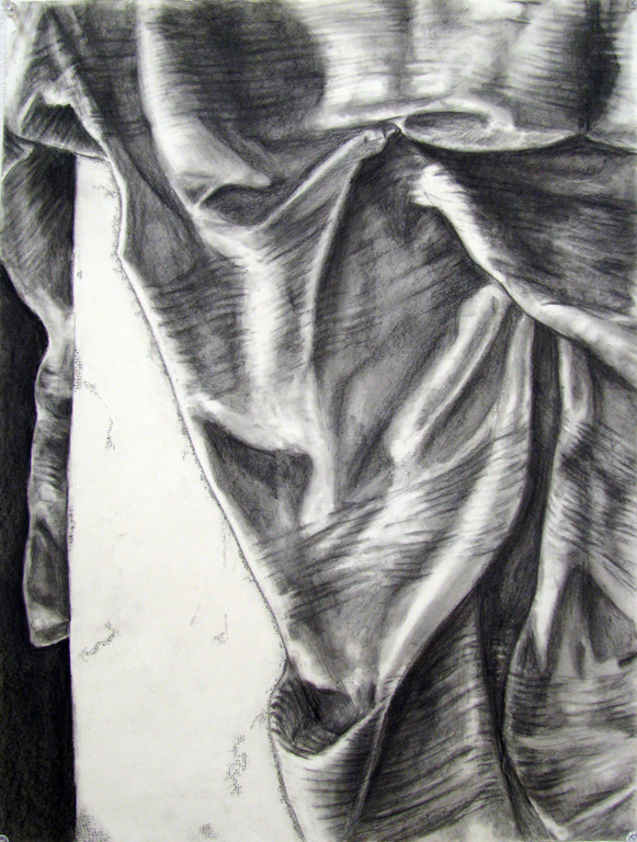
Progressing from the use of your ink pen for hatched value, we will now be moving into the use of charcoal to achieve a much more subtle and complex expression of value. Beginning in today's class, you will be spending a total of three class periods developing a drapery study. There is a rich tradition of artists exploring value through the study of drapery. Fabric can be arranged to fall in such a way that a complex surface results, allowing light to settle on that surface to create a landscape of complex value relationships. The folds can create edges and little caverns that hold shadow, in addition to creating shapes of value that activate the composition. Additionally, the drapery can contain patterns, such as raised stitching or ridges, that magnify the changes in surface contour. Historically, the drapery study has been executed in service of larger projects-- Leonardo da Vinci's numerous studies were preliminary investigations to better understand how drapery can relate to the human form that he was depicting in his painted works.

When creating your own drapery study, begin with the usual practice of composing a series of thumbnail sketches in which you will consider how to fill the entirety of your picture plane with the drapery. Consider where you will crop your image-- see the shadows and folds as elements within a composition of interlocking shapes. Consider how those interlocking shapes fit within your composition. After you settle on a composition, very lightly and loosely sketch the drapery onto your paper with graphite. Do not press hard or erase any lines-- this will affect how your charcoal adheres to the surface of your paper. If, for instance, you draw a hard line and then erase it, when you place your charcoal down, it will not settle into where your line was drawn-- you've essentially inscribed a "trench" into your paper that will show up as a white line.

After you create this sketch-- which should take no more than ten minutes, begin building your value using your charcoal. Build light toward dark. If you go dark too quickly, you cannot go back to light very easily or most of the time at all. Layer your value and build to the darkest parts. In manipulating the subtle range you need to achieve-- you must make use of your blending sticks to create transitions, your chamois to lightly remove and smooth out areas of value, and your blue kneaded rubber eraser to lift, not to erase, value. The kneaded rubber eraser picks up charcoal-- do not try to use it like your white rubber eraser.

Your goal is to achieve is balanced range of value so that your study is not too dark or not too light, but is a successful balance between light and dark contrasts with equal emphasis on all of the parts of value discussed in class, including the highlights and any reflected light.

Important note: Please remember that shadows are transparent, not opaque. Since we are not working with the complete absence of light, if you are looking carefully, and thinking carefully about building your value, you will see information beneath a show. Think of the shadow as a projection that is laying atop your fabric, and that are still able to see some of that fabric through the shadow.

I've provided an example of a drapery study below, created by a student last semester. The top image is the full study, followed by a series of details. This will be the same piece of fabric you will be using, so please take not of how the student has used value to carefully define the ridges on this sheet.


Tuesday, October 25, 2016

DRAWING CLASSES: Homework Assignment #8: VALUE: HATCHED PEN STUDIES


Your next investigation of value will involve the use of cross-hatching. That is, creating a network of lines in which they cross over one another in varying degrees of density in order to express value (the perception of the relative lightness or darkness on the surface of your model, caused by lighting conditions).


You will be creating hatched value studies in which you will need to accurately record areas of value on your subject, by building cross-hatched lines accordingly. You will be using your fine-tipped Micron ink pens, and it is quite possible that you may use its ink supply up on this drawing, and may need to purchase another. If your pen does begin to run out, save it-- for you may use the dwindling ink supply to render some areas of softer value. Rather than creating heavy outlines around your subjects, build and define the edges using value, in a way that the volume or mass of your forms is made clear by its relationship to light. You will be making this drawing on a sheet of your bristol board.

- Create a small arrangement with at least two glass vessels (vase, bottle, bowl, or drinking glass), a crumpled sheet of white paper, and a fruit or vegetable that is sliced open and arranged to show its interior.
- Light it carefully with a single light source aimed from one direction so as to create shadows.
- This project will be finished over the course of two weeks, so you should be spending a total of eight hours on it.
- Create a series of compositional thumbnails.
- Lightly create a sketch of the composition of your choice on a sheet of bristol board.
- Do not outline your subjects with heavy ink lines-- rather, the edges of your objects will be defined by value, by degrees of lightness and darkness. Remember to carefully construct value-- paying attention to the parts of value as discussed in class, and reflecting that understanding with a varying density in your cross-hatched lines.

* Continue to remember our discussions on composition-- Avoid large empty, open areas, and bring your subject forward so that you can "get into it." Also, avoid uncomfortable squeezing of space, by having your objects resting on the edge of your picture plane-- either give them more space, or crop them. As always-- correct perspective and proportion is essential.

BEGINNING DRAWING: DUE MONDAY NOVEMBER 14.

DRAWING FOR NON-MAJORS: DUE THURSDAY NOVEMBER 10.


DRAWING CLASSES: LECTURE IMAGES: DRAPERY STUDIES

Leonardo da Vinci


Albrecht Dürer


Fra Bartolomeo

DRAWING CLASSES: WENCESLAUS HOLLAR PRINTS

Etchings of shells by Wenceslaus Hollar (1707-1677), which demonstrate the use of hatching and cross-hatching as a means to express value. Please take note of how these lines record the surface contours of the subject... There are more images by Hollar that can be seen if you visit the link to a digitized collection of his works, under the "LINKS" section at the right of this blog.


Monday, October 24, 2016

RESOURCES: Perspective Drawing

I have spent a little bit of time online looking for some very basic videos and images that may help you with perspective drawing.

The first is a short video that demonstrates one and two-point perspective drawing:


Here is a video demonstrating the use of one-point perspective in drawing an interior space:


Additionally, here are some images that may assist you:

One-Point Perspective


Two-Point Perspective


Rendering Circles in Perspective

Wednesday, October 19, 2016

DRAWING CLASSES: VALUE: HIGH CONTRAST

For your first foray into an exploration of value (or the issue of light - dark perception), you will be creating a high contrast value study in the studio. This study will ignore subtle gradation or transitions in the shadows on your model, and you will instead see those shadows as solid shapes that help to define the mass or volume of your subject. You will be using ink to create these solid areas of shadow, created through the use of a single lighting source.

Here are a few student examples:


DRAWING CLASSES: HOMEWORK ASSIGNMENT #7: VALUE SCALES

For this week's homework, you are to create a total of six value scales using different drawing media.

Each value scale will be in eight steps, with each step measuring 1 x 1 inch, moving from black to a lightest grey (close to the white of your paper). You need to use your Strathmore drawing paper (not Bristol board), and I suggest you carefully measure all the scales out with a ruler, drawing each of the eight boxes out using a pencil.

When drawing or shading, you may use your drafting tape to help create clean edges, and then carefully remove the tape. (note: so as to not tear your paper, the tape must have very low tack; you can reduce it's tack by tamping your fingers on it).

When you are finished, you may have to spray fixitive on the scales that were created using graphite and charcoal, so that they will not smudge or smear.

1. Ink Pen: Stipple

2. Ink Pen: Cross-Hatching

3. Graphite: 2B-6B (lightly building value, without pressing too hard into the paper; sketch using the side of your graphite tip)

4. Graphite:HB-4H(again, lightly building/layering, as mentioned above)

5. Ink Wash (addition of water to ink, to thin it out in increments)

6. Charcoal (starting dark and laying down charcoal softly to build in layers; do not press hard)

BEGINNING DRAWING: DUE MONDAY, NOVEMBER 7

DRAWING FOR NON-ART MAJORS: DUE THURSDAY, OCTOBER 27

Wednesday, October 12, 2016

DRAWING CLASSES: Homework Assignment #6: Interior Perspective Study

Now that we have delved into single and two-point perspective, you have begun to develop the tools you need to accurately render dimensional space on paper. For this assignment, a continuation of what you have been doing in class, I would like you to create a perspective study of the interior of either a diner, a bar, or a laundromat. In each case, the interior has elements-- be they tables, chairs, booths, stools, counter, or banks of washers and driers, that will put your perspective drawing skills to the test.

This drawing will also get you into the habit of working in the real world, which I always recommend in order to encounter the odd, unplanned detail. Time is always the issue when working outside the studio-- a finite amount of time. So please take note of every detail you can, making small notes in a sketchbook or on sketchpaper, so that if you cannot finish the piece in its entirety "in the field," then you have enough information to do so at home.

Your drawing should be linear only-- freehand without any guidance from a straightedge, using graphite on your good Strathmore paper, filling the entire space of the paper.

BEGINNING DRAWING: DUE MONDAY OCTOBER 31. DRAWING FOR NON-ART MAJORS: DUE THURSDAY OCTOBER 20.


Sunday, October 9, 2016

DRAWING CLASSES: Homework Assignment #5: Perspective drawing of Stacked Boxes


For your homework assignment, you are to continue your refinement of drawing with the use of accurate perspective. 

Much like the in-class project, you will need to gather together a selection of boxes, at least five (hopefully more), and stack them at varying, turned degrees so that they are seen at different angles. You may also lean some boxes against one another. The purpose of this is to challenge your ability to draw correct angles, as they relate to a set of vanishing points.

I will be checking for accuracy, as far as correct perspective is concerned.

Your homework should be drawn on your larger, good drawing paper, using graphite, and NOT using a ruler for the lines. Drawing lines freehand, without the use of a ruler, is excellent practice so that one day you will not require a ruler. Besides, a little wobble also gives the drawing more character. You can, however, use the ruler to check the accuracy of your angles.

Please continue to consider how your image occupies your paper (vertically or horizontally), without wasted space.

BEGINNING DRAWING: DUE MONDAY, OCTOBER 24.
DRAWING FOR NON-ART MAJORS: Due Thursday, October 13.


Two-Point perspective study of stacked forms (similar to box exercise), in which each object is defined by a set of points resting on the eye-line. Note how the circular forms are rendered in correct perspective. One anomaly in this drawing are the left and right edges of the table, which can be adjusted a bit more as they lead back to a vanishing point...

And here are two studies made with the additional use of value, which as you can see greatly enhances our understanding of space and works in tandem with perspectival rendering. This is the next stage we will headed toward-- continuing our exploration of perspective, with the addition of dealing with how light falls on objects...

DRAWING CLASSES: Homework Assignment #4: Pen + Ink Window View

As a continuation of the work done in class, using your pen nib and ink, you will be creating a composition on bristol board with the following subject: a view looking through a window into an exterior landscape. You must draw any curtains, moldings, or wall information that surrounds the window, and then you will draw the information seen through the window-- trees, houses, wires... whatever it is that you are seeing.

1. Produce compositional thumbnails on newsprint, employing quick gesture with graphite.

2. Choose the best composition and then very lightly draw it onto a sheet of bristol board (remember to consider a vertical or horizontal orientation).

3. Using only your pen nib and ink, carefully render the composition.

Keep it clean, without smudging.

Consider the line quality as it helps to describe the scene, controlling your pen to transition between thin lines and thicker lines to help describe form.

BEGINNING DRAWING: DUE at the beginning of class on MONDAY, October 17.